Solar Energy

Energy Industry: Solar Energy
Overview
Community Solar is an energy firm, providing power in a dozen of states in America. A vast majority of their clients are household customers and the rest commercial customers. They offer three types of products: fixed monthly, power purchase agreement (PPA), and pre-pay.
Every month the accounting team uses records in Excel spreadsheets to produce billing reports. Managers would have to wait one to two weeks to get what they need.
Good news is, things can be done differently to get managers the insights faster.
The objective of this project is to automate process to ingest monthly Excel spreadsheets into an interactive, self-serve billing report. The goal is to help managers access the information they need when they need it because their ability to adjust relevant strategies in time depends on how fast they can get a good report.
Building Data Pipeline
Hundreds of Excel spreadsheets in different Folders > Power Query > Power BI.
Every year, data are stored in two folders, production data folder and rate data folder.
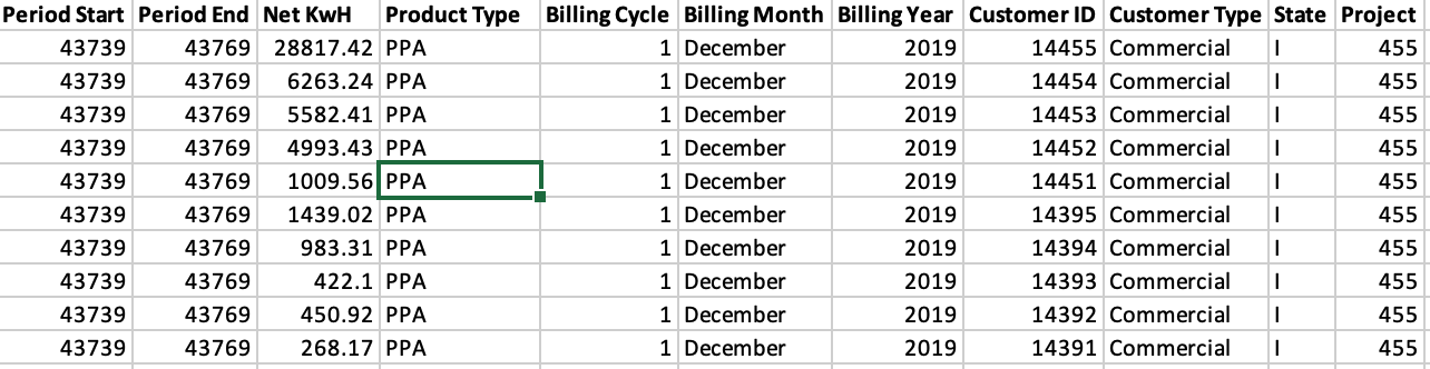
There are 12 spreadsheets inside the production data folder per year. Each spreadsheet contains 20 - 22 billing cycles depending on the number of business days in the month. That makes 240-264 worksheets in total per year.
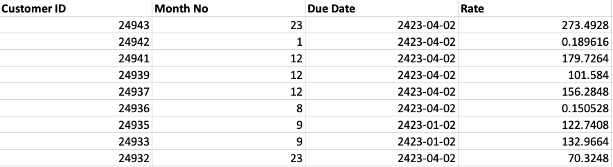
Similarly there are 12 spreadsheets inside the rate data folder. Each contains the rate per customer in the month in record.
In this project, the data sample has three months in Q4: Oct, Nov, and Dec of 2019. Production data has three billing cycles on the first, the second, and the third day of the month.
Rate data contains the rate per customer per associated month: Oct, Nov, and Dec.
Since all the Production data spreadsheets have identical data structure, I used the Combine Files command to load multiple Excel spreadsheets to Power BI (Unions).
I then merged the Production table with the Rate table into one table called Merged, using a unique ID formed by a combination of Billing Month and Customer ID columns (Joins).
Defining KPIs
There are five key KPIs to be reported:
1
2
3
4
5
Billed Amount = SUM ('Merged'[Billed Amount ])
Net KwH = SUM ('Merged'[Net KwH])
Bills Issued = COUNTROWS ('Merged')
Billed Amount/Bill = DIVIDE ([Billed Amount], [Bills Issued])
Net KwH/Bill = DIVIDE ([Net KwH],[Bills Issued])
Developing Dashboards
Five dimensions, Project, Month, Customer Type, Product Type, and State, are presented in the Filter panel on the left hand side for users to easily select the dimensions they wish to drill down.
Five KPIs are shown on the right hand side. When users select any KPI, they will see the middle visuals change accordingly. These visuals show the most frequently used dimensions by the users.
Key Results
Looking at the dashboard, managers can quickly see what happened in Q4, take for example:
Company acquired more customers but total revenue declined, possibly due to weather seasonality: shorter daytime and lesser amount of sunlight on average than the summer adversely affected the power production, hence the reduced consumption, except for California (C) and Florida (F).
Commercial customers paid $2,450 per month on average and residential customers $157.
PPA is the most preferred product among all customers, especially the commercial. Residential customers still prefer PPA but a significant number are risk aversive and choose fixed monthly rate. Company could price that into the product and charge a premium.
Automating Process
Information has its time value. Those who can get information in the shortest amount of time gain the most. And automation, as shown in this project, is a way to achieve such an advantage.
Every time a new spreadsheet is dropped into the folders, it will be automatically updated to the report. Pricing analysts and managers in charge gain insights instantly, helping them develop products and pricing strategy to influence consumption of customers and optimize revenues.
Credits
Credit acknowledgement to Karsten Würth for the cover picture I used in this article.